Why Wedding Photo Color Grading Makes or Breaks Your Album [Expert Guide]
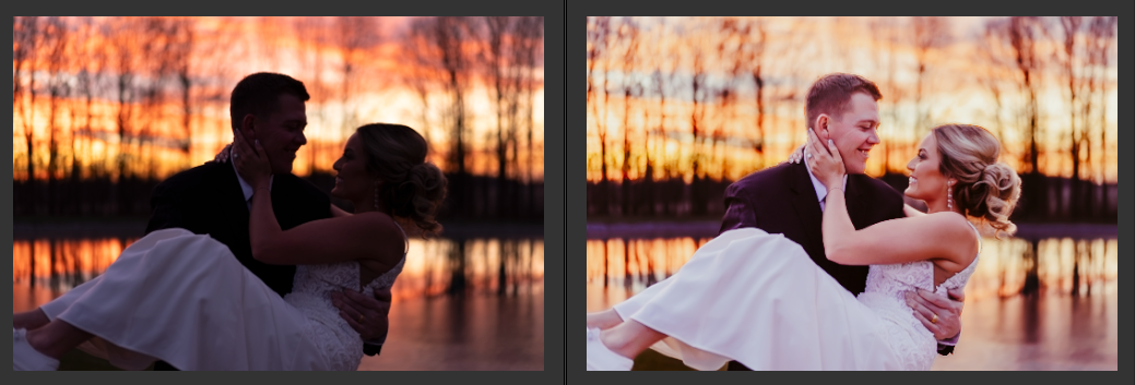
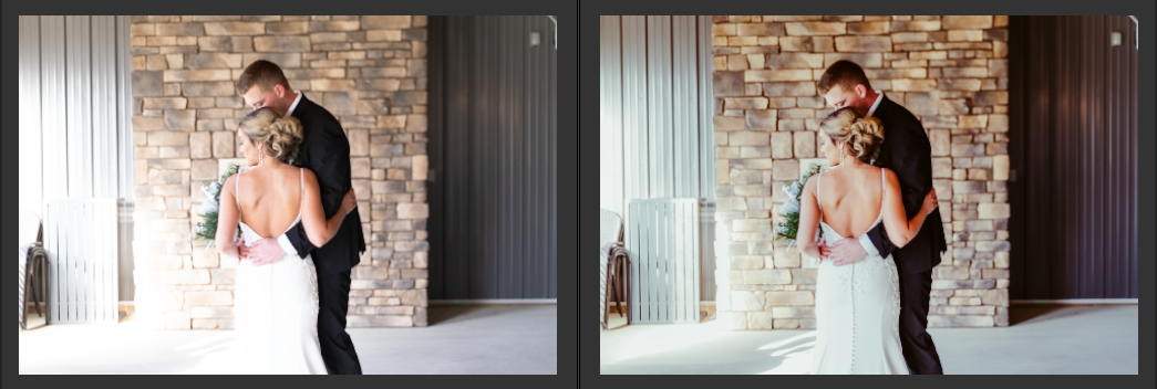
Your wedding photos capture one of life's most precious moments. However, even perfectly composed shots might fall short of your expectations without proper color grading. Whether your images appear too dark, lack vibrancy, or simply don't match your vision, wedding photo color grading can transform ordinary captures into stunning memories.
In fact, many photographers confuse color correction with color grading, leading to missed opportunities in photo enhancement. Understanding what color grading in photography entails helps you achieve that dreamy, cinematic look your wedding album deserves. This guide walks you through essential techniques, popular styles, and professional tips to elevate your wedding photographs from good to extraordinary.
Understanding Color Grading Fundamentals
Color grading essentially transforms the entire mood of your wedding photos through deliberate color adjustments. While many photographers use the terms interchangeably, color grading differs significantly from color correction. Specifically, color correction fixes technical issues like exposure and white balance, whereas color grading creates an artistic style that shapes how viewers feel when they see your photos.
Understanding color psychology helps you make informed decisions about your wedding album's aesthetic. Different colors evoke distinct emotional responses:
- Warm tones (red, orange, yellow) create feelings of intimacy and joy
- Cool tones (blue, green) promote calmness and serenity
- Neutral tones (white, gray) convey elegance and sophistication
Furthermore, proper color grading requires attention to technical aspects like white balance and exposure. Consequently, many professional photographers start with basic corrections before applying creative color grades. This ensures your photos maintain natural skin tones while achieving your desired artistic vision.
Above all, consistency across your entire wedding album matters most. A cohesive color grade ties all your photos together, creating a unified story of your special day. When choosing your color grading style, consider the overall theme and atmosphere of your wedding, as these elements should complement each other perfectly.
Essential Color Grading Techniques for Wedding Photos
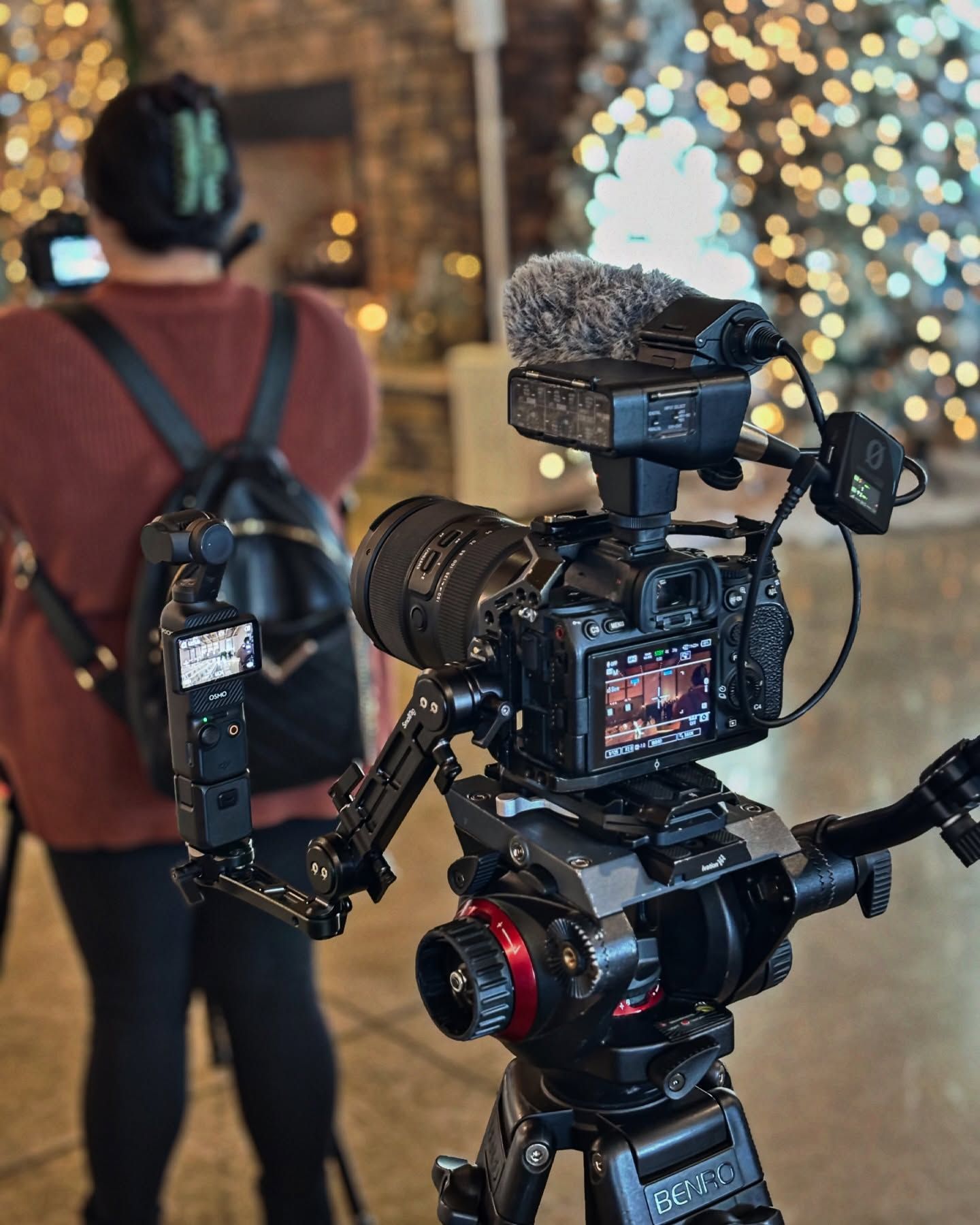
Mastering color grading techniques starts with understanding the essential tools at your disposal. Particularly in Lightroom, the Color Grading panel offers powerful controls for enhancing your wedding photos.
Start by identifying the current color balance in your images. For optimal skin tones, the red percentage should be higher than green, and green should be higher than blue. Additionally, each value should differ by at least 2% from the next color to maintain natural-looking results.
Here are the key techniques for achieving stunning color grades:
- Adjust exposure before color grading to ensure proper foundation
- Use Color Curves to fine-tune specific tonal regions without affecting global colors
- Apply selective adjustments to maintain natural skin tones
- Utilize luminance controls to perfect the brightness of specific colors
Notably, when working with different skin tones, it's essential to avoid overexposing or warming up the images excessively. Subsequently, this can cause POC skin tones to render several shades lighter than reality.
For consistent results across your wedding album, consider breaking down your editing process into same-scene chunks. First, edit one photo from each scene to your liking, then sync those edits to similar photos. This approach ensures uniformity while maintaining the unique characteristics of each setting.
Remember to pay special attention to mixed lighting situations. Essentially, you'll need to balance both ambient and artificial light sources to achieve natural-looking results that enhance rather than alter your subjects' true appearance.
Popular Wedding Color Grading Styles
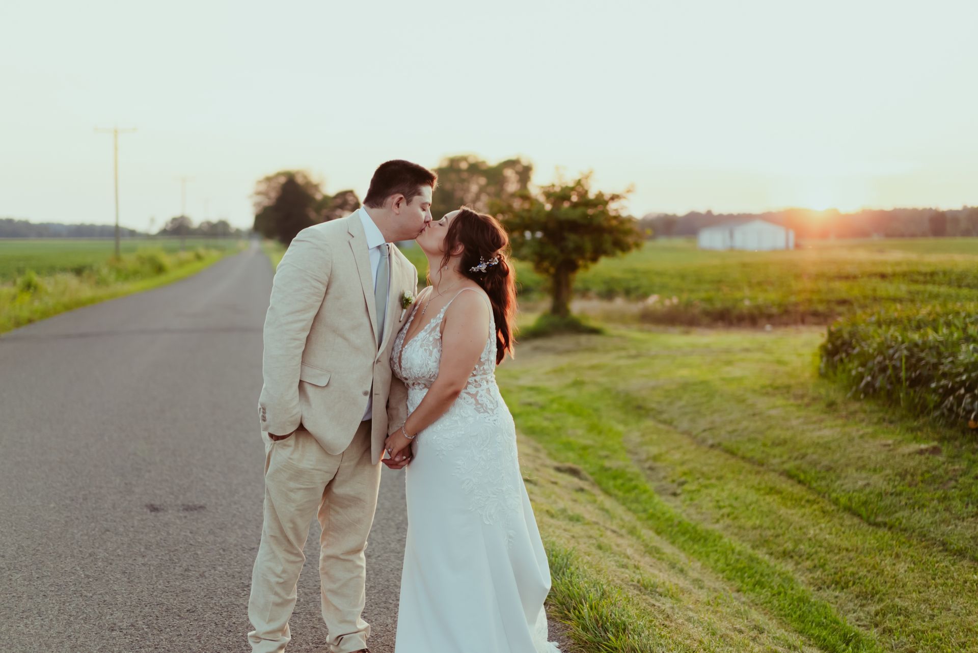
Initially, the most sought-after wedding photo color grading styles reflect distinct artistic visions. The light and airy style dominates modern wedding photography, characterized by:
- Soft, lighter colors in backgrounds
- Gentle fade from light to dark
- Warm tones without excessive orange
- Simple, curated compositions
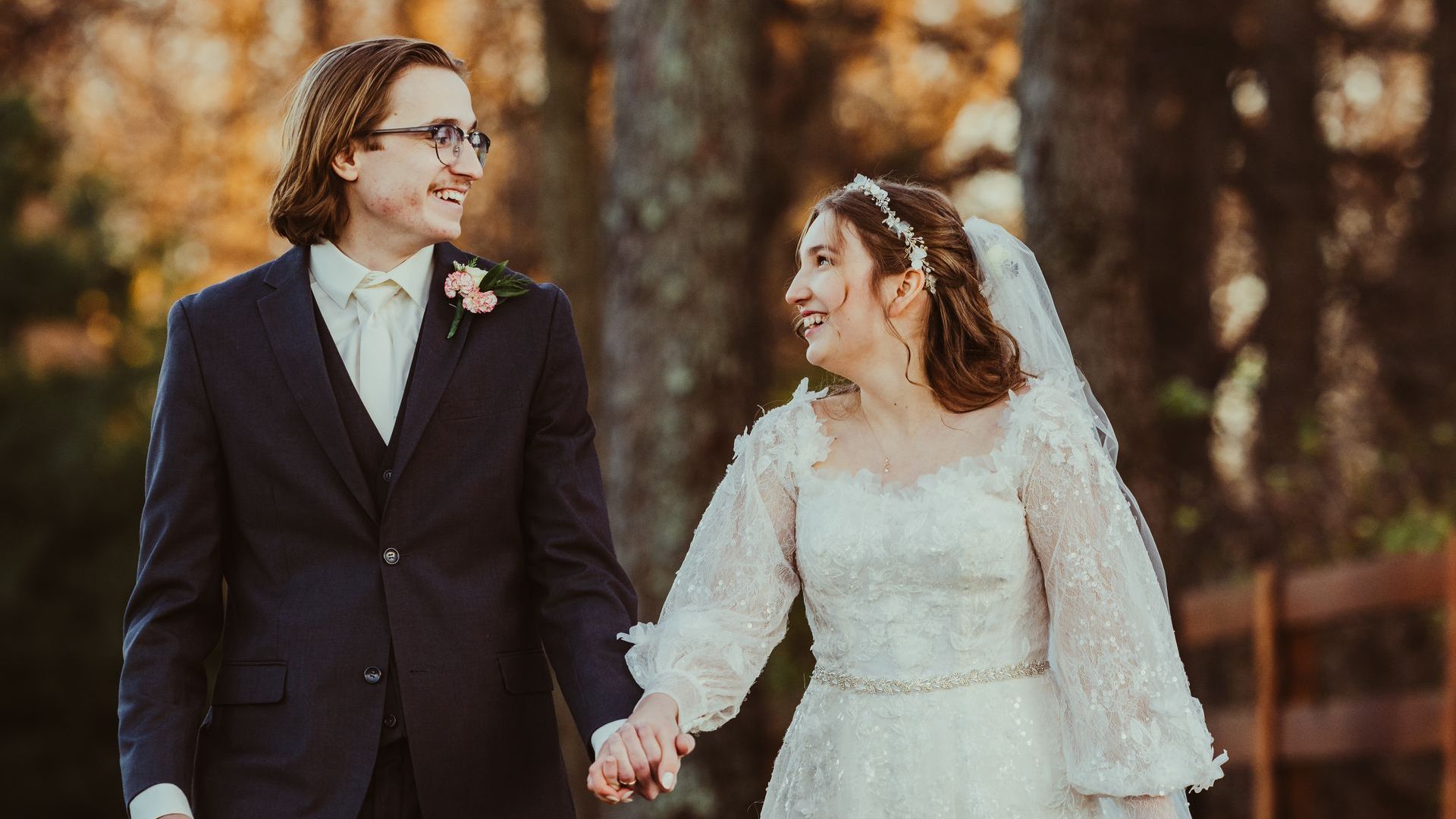
Notably, recent trends show a shift toward preserving authentic skin tones. Professional photographers now opt for minimal corrections, maintaining natural complexions instead of dramatic manipulations that were common before 2020.
For couples seeking timeless elegance, monochrome styles remain a classic choice. Modern approaches extract multiple shades of the same dominant color, occasionally incorporating a contrasting hue to add visual interest.
The muted vintage palette has gained popularity, offering a softer visual experience. This style processes frames in surreal tones, utilizing tints and textures to create an aged appearance without compromising image clarity.
Essentially, color blocking presents exciting opportunities, especially during traditional ceremonies like Haldi. This technique balances contrast and saturation to create striking visual impacts while maintaining natural skin tones.
Undoubtedly, the subtle and soft approach continues to captivate couples seeking a dreamy esthetic. This style emphasizes gentle highlights and minimal adjustments, allowing the natural beauty of your wedding moments to shine through.
Conclusion
Color grading stands as a crucial element that transforms ordinary wedding photographs into timeless masterpieces. Though technical skills matter, your choice of color grading style ultimately shapes how future generations will experience these precious moments.
Professional photographers now embrace a balanced approach, prioritizing natural skin tones while adding artistic touches that enhance rather than overshadow genuine emotions. Whether you prefer light and airy esthetics or classic monochrome, consistency across your entire album helps tell your wedding story effectively.
Remember that successful color grading starts with proper exposure and white balance adjustments. This foundation, combined with thoughtful color manipulation, ensures your wedding photos maintain their authentic beauty while achieving your desired artistic vision.
Your wedding photos deserve careful attention to color grading - they're not just images, but treasured memories that will last generations. Take time to discuss your preferred style with your photographer, ensuring they understand your vision while maintaining the natural essence of your special day.
FAQs
Q1. How important is color grading in wedding photography?
Color grading is crucial in wedding photography as it sets the mood and tone of the images. It helps create a cohesive look across the entire album and can significantly impact the emotional response of viewers. However, it's essential to balance artistic vision with accurately representing the couple's chosen color scheme.
Q2. What are some popular wedding photo color grading styles?
Popular styles include light and airy, dark and moody, and timeless classic looks. The light and airy style features soft, lighter colors, while dark and moody processing creates a more dramatic atmosphere. Timeless classic looks aim for natural, true-to-life colors that will stand the test of time.
Q3. How can couples ensure their wedding photos reflect their chosen color scheme?
Couples should thoroughly review a photographer's portfolio, ask to see full wedding galleries, and discuss color preferences before booking. It's also helpful to have an engagement session to get a feel for the photographer's style. Clear communication about color expectations is key to avoiding disappointment.
Q4. What techniques do photographers use for consistent color grading across a wedding album?
Photographers often use tools like the Color Grading panel in Lightroom to create consistent looks. They may adjust exposure, use Color Curves for specific tonal regions, and apply selective adjustments to maintain natural skin tones. Many also break down editing into same-scene chunks for uniformity.
Q5. How can couples address concerns about color grading after receiving their wedding photos?
If couples are unhappy with the color grading of their photos, they should approach the photographer politely and explain their concerns. They can request adjustments to better reflect the true colors of their wedding day. In some cases, offering to pay for additional editing time may be necessary to achieve the desired result.